Progress Photos


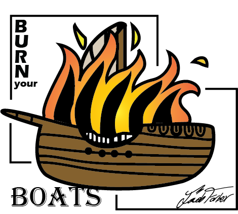
Finished Design:
TAG Critique:
T) I like the way the text looks in relation to the other parts of this work.
A) Why did you do this particular design?
G) I think that next time, you could provide more meaning behind the work (inside the work?).
Artist Statement:
My Artwork is a cartoon of a burning boat with the quote “Burn your boats” as a part of the design. There really is no subject matter for this project because the prompt is just to create a design for a T-shirt. I can’t think of a good name for this design besides “The Burning Boat”. There aren’t any special elements or principles in this artwork because I wanted to keep this one simple.
I made my logo in Adobe Illustrator with the pen tool and the brush tool. I haven’t used the surface’s pen the whole year until now and it helped a lot with this design.
My artwork was inspired by something my teammate said to our lacrosse team at the end of the last practice which was the day before the state championship. He said that when the Spaniards were on a mission to capture treasure from the Aztec empire they arrived at shore and their leader ordered them to burn the boats behind them. Burning the boats behind you represents a point of no return, commitment, and that there is no turning back. Realizing that they had no option of turning back, the Spaniards rallied behind their leader better than ever before and conquered the Aztec Empire.
My goal for this artwork is to demonstrate the burning boat metaphor with a picture and I think I succeeded in doing that. My goals as an artist though are to impress myself more and more with every art piece of art I make and actually this time I wasn’t too blown away.
I didn’t really learn anything from making this artwork because I only used the knowledge I already have to make this. The final piece is what I imagined it to be because I wanted it to be simple and just a cartoon of a burning boat so I think that this logo is a success.


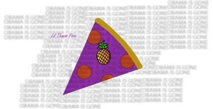
 Beginning
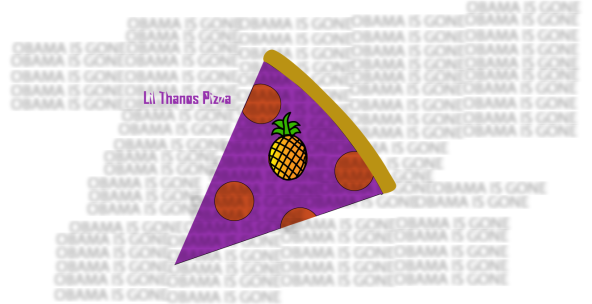
 End
End