 Beginning
Middle
 End
End
Artist Statement:
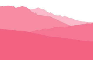
My artwork is a mountain landscape in the color pink but the farther back the mountains are the lighter the color gets. The subject of this is to show that when something is closer it should be more defined. In this art piece that is displayed by the closer mountains being darker than the mountains behind.
I created my artwork using adobe illustrator pen tools and a picture of a landscape in Italy. I started from the bottom, went over the mountains with the pen tool, then copied all of the points and pasted it into a new layer so the mountains wouldn’t overlap.
My artwork isn’t inspired by anyone and there really isn’t a big idea but there is a point to doing this piece and it is to keep getting better with the pen tool in Adobe illustrator.
My goal for this artwork was to be able to make separate layers that didn’t overlap but rested on the exact same line and I accomplished that by learning how to copy and paste the points into new layers then make them intersect to avoid overlap.
I think my artwork was a success because I know how to use the pen tool in very complex ways now which can help me make cooler artwork down the road.
Peer Review/Critique
1 . I like the way you used the opacity, the spacing of it looks even.
2. Why the Adidas logo.
3. I would suggest doing something harder than the Adidas logo next time, such as the nike logo.